Text Editor: Anatomy of a Sticker File
To discuss the elements of a Final Exhibits 2 XML file, we are using sticker CSR-003.xml, as it embodies everything the stickers are currently capable of:
- Text Inputs
- SVG-based graphic elements, such as:
- font family, and font size,
- Simple SVG shapes and elements,
- Embedding complex SVG graphics
For this walkthrough, I'll be using Notepad++, not Microsoft Notepad.
A Final Exhibits 2 XML sticker file is organized broadly into two sections:
- The
<inputs></inputs>block, where the editable text fields (shown beneath the exemplar sticker) are defined. - The
<graphics></graphics>block, where the visual design of the sticker is described, including fonts, text sizes, and any graphical shapes. Everything in the graphics block follows the SVG (Scalable Vector Graphics) format.
The <inputs></inputs> Block
- Each
<input .....> </input>row defines a single editable text field on the sticker. - Each input must have a unique "name" and label" -- here they are
name="deponent1" label="Deponent1" - You can also specify default text that appears when the sticker loads -- in this case, it's"Deponent"
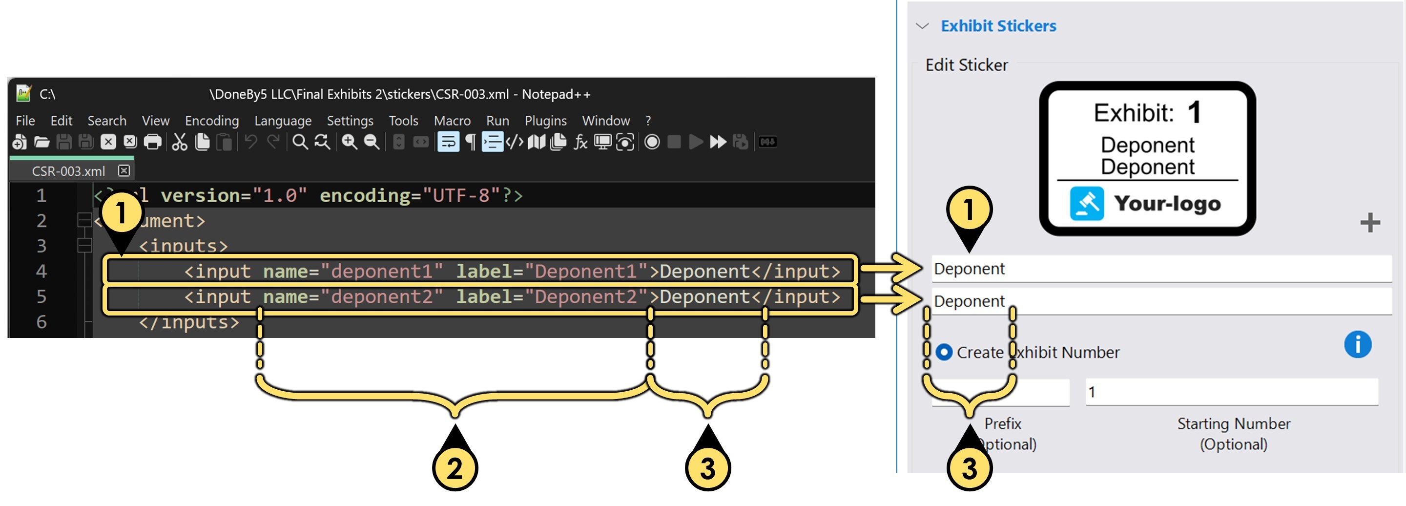
The <graphics> Block
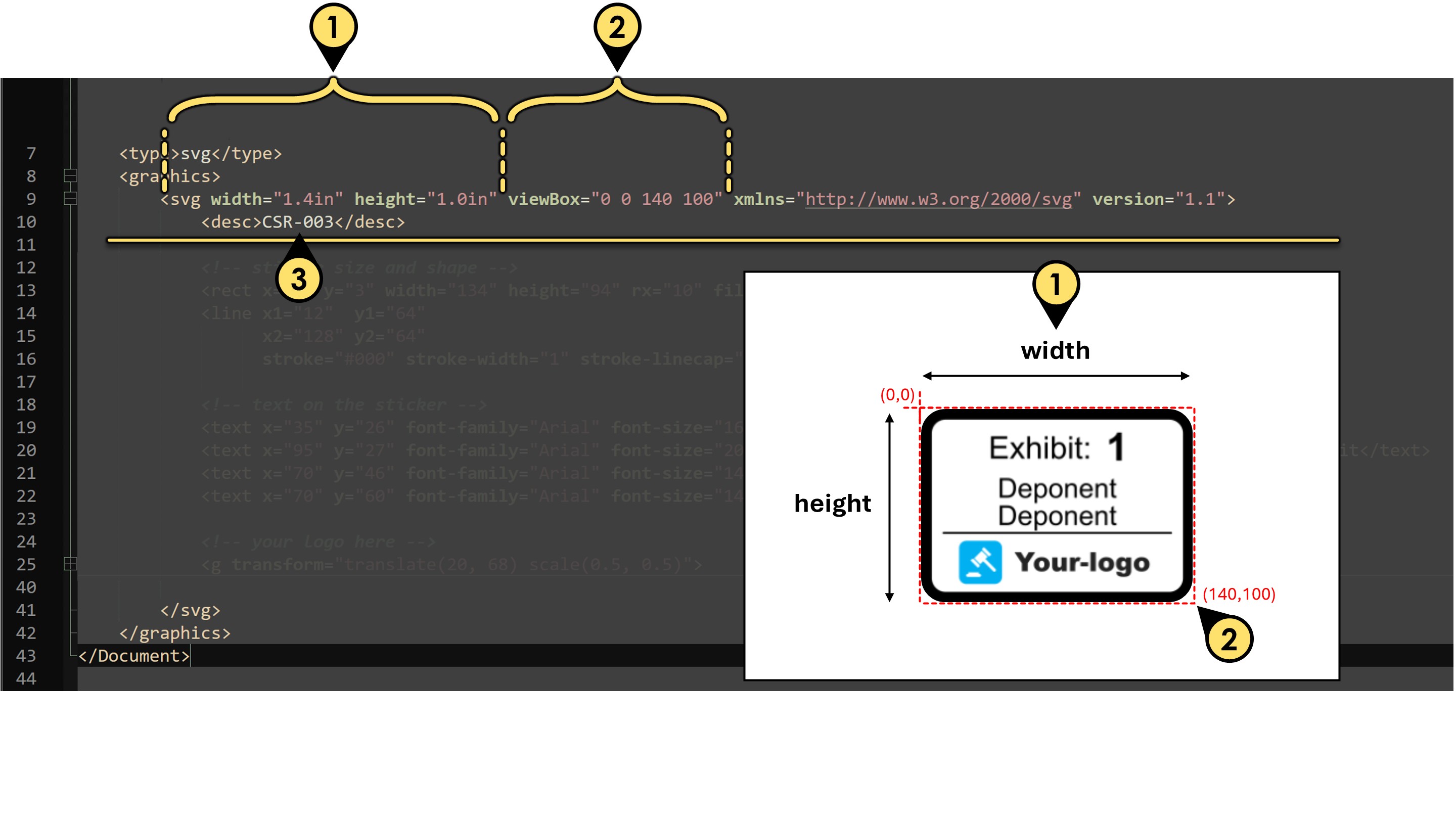
The first part of the "graphics" block defines the overall size, resolution, and name of the sticker:
- Width and height specify the physical dimensions of the sticker (i.e., the SVG artwork) in inches.
- The viewBox attribute controls how the SVG content scales and fits within the defined space. In this example, a viewBox of 140×100 units is mapped to a 1.4" × 1.0" sticker. These units are how we will reference the placement of the elements on the sticker.
- The name of the sticker appears next—and while not required, I recommend it match the XML filename for clarity.
Creating the Sticker Shape
Use the rect tag to create the sticker
-
Choose your
stroke-widthfirst
The stroke-width sets the thickness of the border . In this example,stroke-width="6" -
Because border is 6 units thick, the origin for the shape and its dimensions are below
<rect x="3" y="3" width="134" height="94" ... />Those values were chosen to leave space for the 6-unit border. The overall viewBox is 140×100, so subtracting a 3-unit margin on each side keeps the shape neatly centered with room for the stroke.

-
Optional -- here we rounded the corners with
rx="10". -
Use the
fillandstrokeattributes to define the color of the background and stroke, respectively.- In our example: fill="#fff" sets the background to white.
- You can use any valid hex color code, such as #ffffff for white, #000000 for black, or #FF0000 for red.
Tip: When all 6 color components are the same, you can use the 3-character hex shorthand:
#000 = #000000' (black) <br>#fff = #ffffff(white) <br>#ccc = #cccccc` (medium gray)
To make the background color customizable in the app, replace the hex code with a variable reference: fill="@backgroundColor"
This tells Final Exhibits 2 to treat the background color as a user-controlled setting, using the built-in color interface.
Add a Line
- Start and end points
The line begins at coordinates (12, 64) and ends at (128, 64), creating a horizontal line. - Stroke color
stroke="#000"sets the line color to black (short for #000000). - Stroke thickness
stroke-width="1"defines the thickness of the line as 1 unit. - Line cap style
stroke-linecap="round"gives the line's ends a rounded appearance instead of flat or square.
Add Simple Text
- Position
x="35" andy="26"` position the text so that it starts at point (35, 26) on the canvas. - Font family, size, color, and alignment
font-family="Arial"sets the font to Arial.font-size="16"sets the text size to 16 units.fill="#000"makes the text color black.text-anchor="left"aligns the starting point of the text to the left edge of the string.
- The text
The visible text will be "Exhibit:" -- this is what the user sees on the sticker.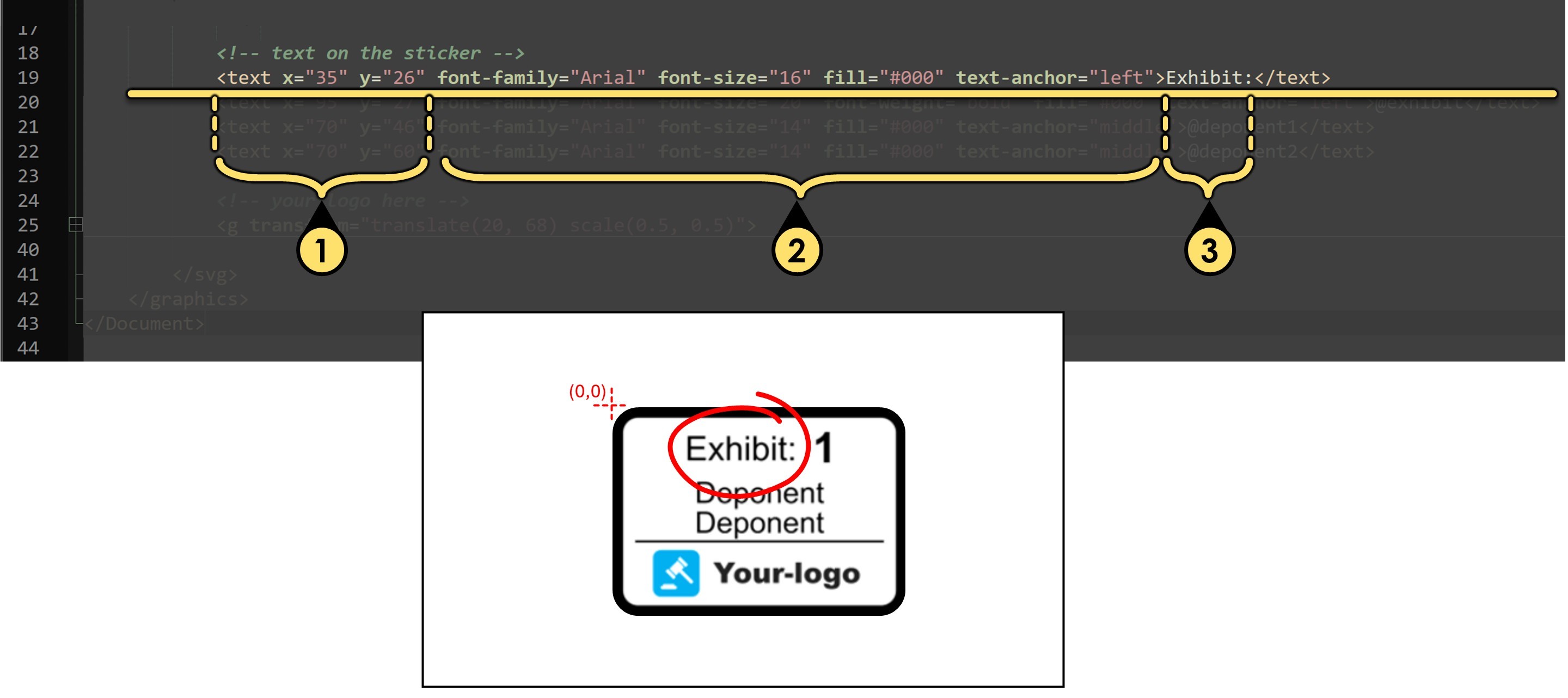
Add Dynamic Exhibit Number
- Position
x="95"andy="27"position the text so that it starts at point (95, 27) on the canvas. - Font styling and alignment
font-family="Arial"sets the typeface to Arial.font-size="20"makes the text slightly larger than the previous example.font-weight="bold"renders the text in bold.fill="#000"sets the text color to black.text-anchor="left"aligns the start of the text to the left edge of the string.
- Dynamic exhibit number
The content@exhibitis a variable, not static text — it tells Final Exhibits 2 to insert the dynamic Create Exhibit Number , ( or Create Exhibit Letter or Use Exhibit Filename as the exhibit number) at this location when the sticker is applied.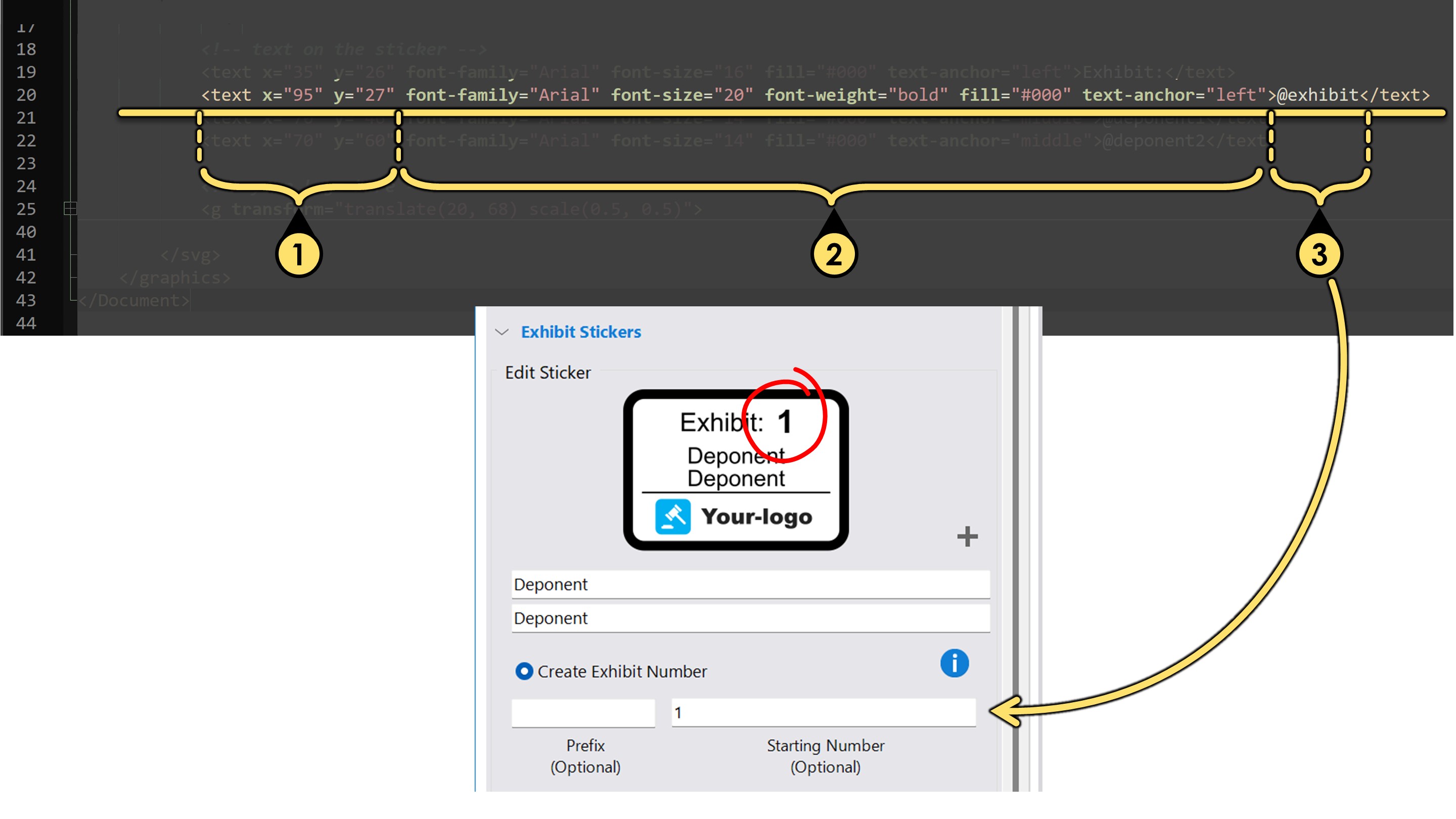
Linking Text to Your <inputs> Fields
1. Position
x="70" and y="46" place the text so that it’s centered horizontally at 70, and positioned vertically at 46.
- Font styling and alignment
font-family="Arial"sets the typeface to Arial.font-size="14"renders the text slightly smaller.fill="#000"makes the text color black.text-anchor="middle"' centers the text horizontally around the x coordinate — so the text is balanced evenly to the left and right ofx="70".`
- Dynamic input field
The content@deponent1is a variable linked to an input field we defined in the<inputs>block. When the sticker is used, this text is automatically replaced with the value entered by the user for that field.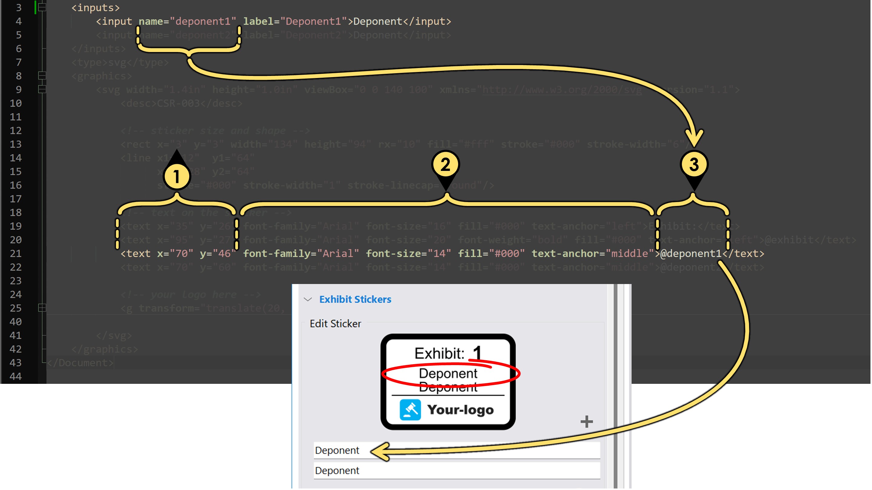
Adding SVG Artwork (Like a Company Logo)
You can add vector artwork—such as a company logo—directly into your sticker design using standard SVG.
-
Wrap your artwork inside a
<g>(group) element
This allows you to apply positioning and scaling to the entire graphic. -
Use the transform attribute to control size and position
For example:<g transform="translate(20, 68) scale(0.5, 0.5)"> <!-- your SVG paths and shapes go here --> </g> -
Paste only the contents of your logo’s SVG file, not the outer
<svg>tag itself.
This helps keep the XML file clean and focused on layout, not document-wide declarations.
👉 See the bottom of this page for a detailed example. -
Adjust the
translateandscalevalues as needed to fit the logo within your sticker layout.
This may take a few rounds of trial and error to get the size and placement just right.
Example: What to Keep vs. What to Remove from an SVG
If you have a logo saved as an .svg file, you can open it in a text editor like Notepad++ to see the code that defines the artwork. Most SVG files begin with a wrapping <svg> tag that sets things like width, height, and viewbox size — but this outer tag isn’t needed when you're inserting artwork into a Final Exhibits 2 sticker.
When you open a typical SVG file, you might see something like this:
<svg xmlns="http://www.w3.org/2000/svg" width="200" height="50" viewBox="0 0 200 50">
  <path d="M10,10 h180 v30 h-180 Z" fill="#00b0f0"/>
  <text x="20" y="35" font-family="Arial" font-size="20" fill="#fff">Your Logo</text>
</svg>
To use this inside your sticker’s <graphics> block, remove the outer <svg> tag and just keep the internal artwork. That means you would paste only this part:
<path d="M10,10 h180 v30 h-180 Z" fill="#00b0f0"/>
<text x="20" y="35" font-family="Arial" font-size="20" fill="#fff">Your Logo</text>
Then wrap it in a <g> tag with transform to control placement and scale:
<g transform="translate(20, 68) scale(0.5, 0.5)">
  <path d="M10,10 h180 v30 h-180 Z" fill="#00b0f0"/>
  <text x="20" y="35" font-family="Arial" font-size="20" fill="#fff">Your Logo</text>
</g>